Camera Connection, 2023
Mobile Design
User Research
UI Design
Visual Design
Prototyping & Testing
Reconstruct’s Capture App is used to capture videos and images for construction projects and monitor progress on-the-go. The first and integral step is connecting a camera to the app. However, this camera connection user flow has been one of the most frustrating pain points for users.
Currently, the camera connection user flow requires the user to leave the Capture App to connect their camera. We needed to evaluate this experience and provide additional in-app support to make this process easier and more intuitive for users.
The Problem
Users frequently need to be coached on how to connect a camera in the capture app workflow.
The current user flow having the user leave the app is too complex and ambiguous, leading users to become quickly confused and not want to use the product.
Business Problem
Confusing user flows causes decreased user engagement and loss of trust in our product and brand.
Possibly losing out on sales opportunities to attract and win customers with our product.
Goals
Streamline our camera connection implementation for stability and scalability
Make it easy for new and returning users to connect new cameras
Make it easy and intuitive for returning users to reconnect to previously connected cameras
Provide camera passwords and complete the entire workflow in-app
Allow us to support and test new cameras faster
Enhance our ability to build new features using a 360 camera
Because there are so many steps the user can take to connect their camera, it was essential to map out each step with a user flow to better understand the user’s experience.
Sketches
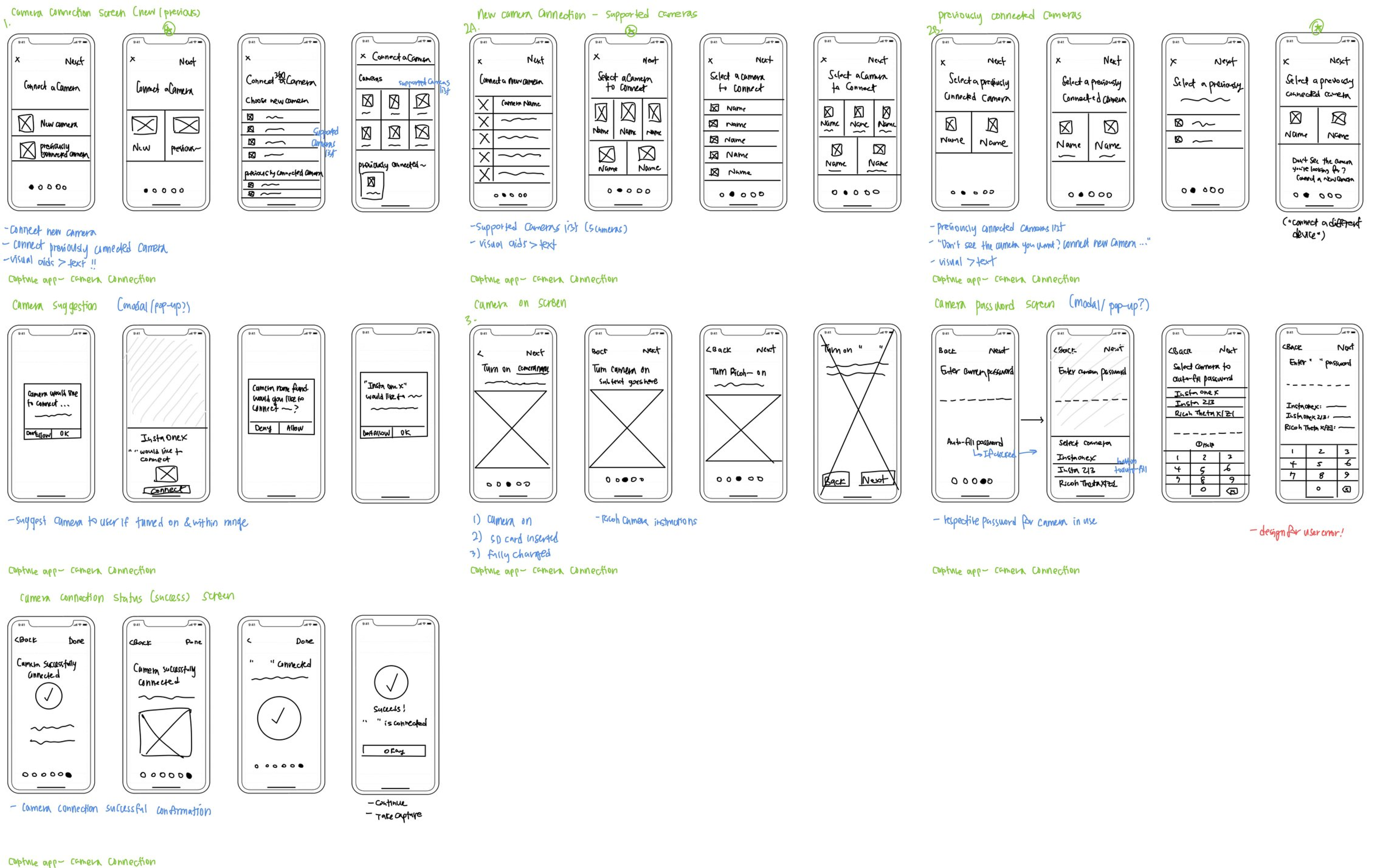
Since there were so many screens to design, I sketched out different variations for each screen to discuss with product managers to receive early feedback and make better design decisions.
Wireframes
After receiving feedback from product managers, I designed mid-fidelity and high-fidelity wireframes.
Design
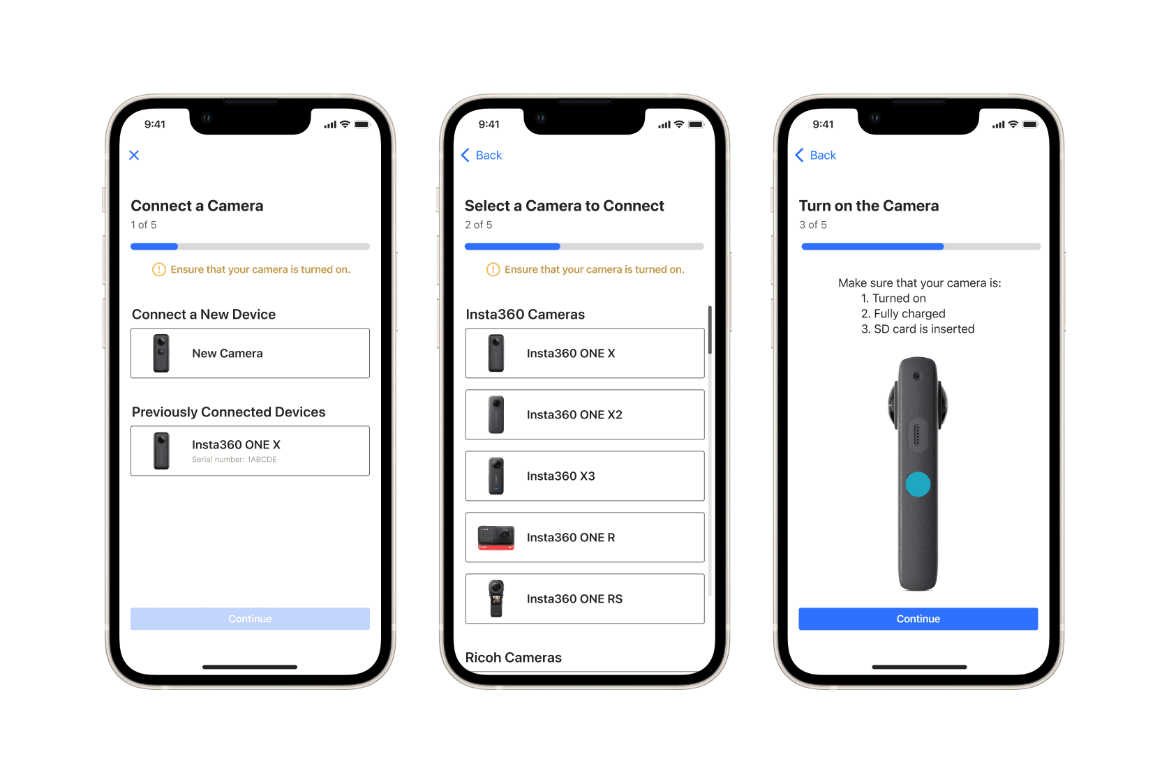
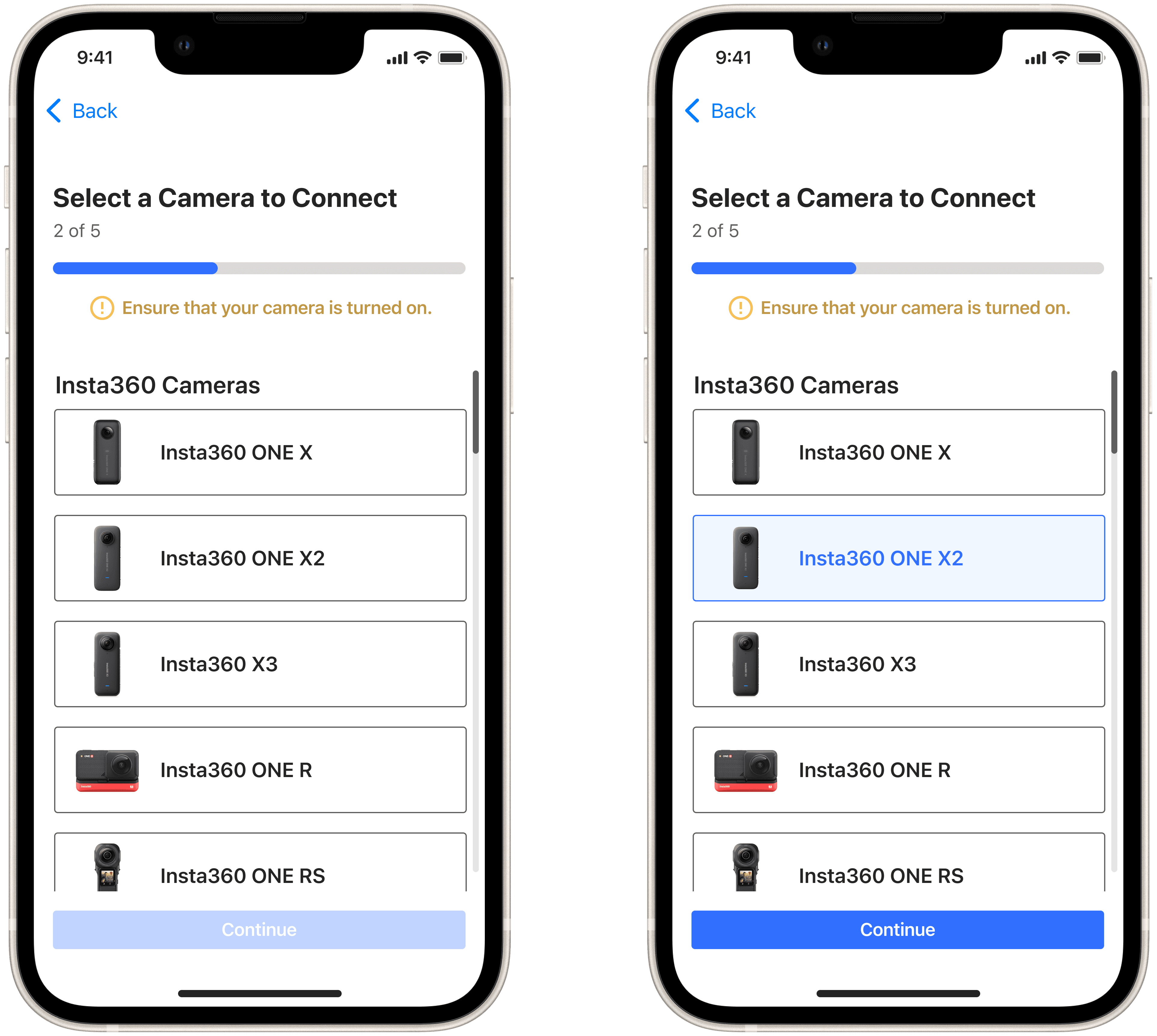
A key component in the camera connection experience is being able to see a list of supported cameras that we support. There are numerous 360 cameras out there, but users do not know which cameras are supported, so there has been a lot of frustration around this. I designed a scrollable list of devices that we support that can be easily recognizable.
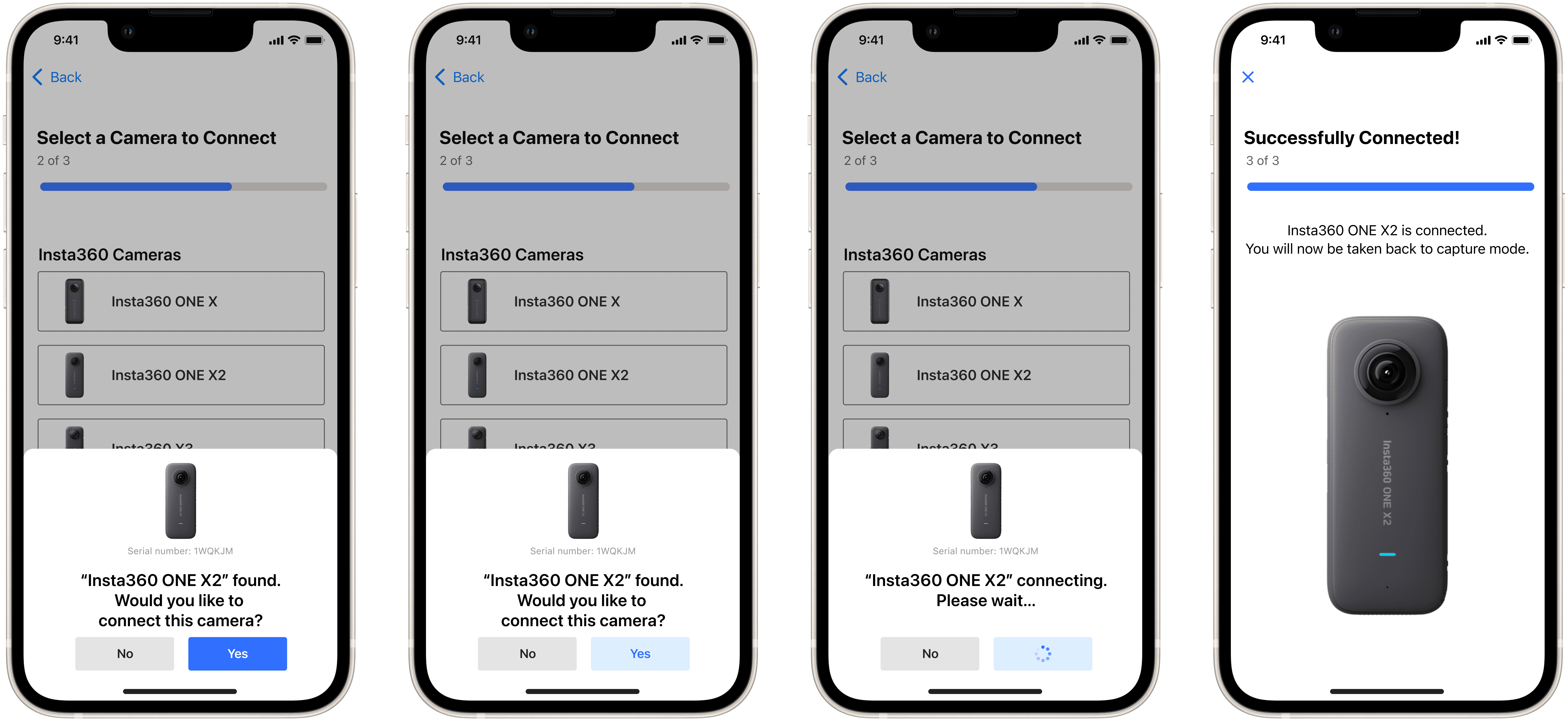
To reduce user clicks and provide a more intuitive experience, it was important to be able to recognize & suggest a camera if it was turned on and nearby. I designed a pop-up that would allow the user to quickly connect to an automatically suggested camera that was found.
Perhaps the most frustrating workflow has been finding the camera password. Depending on the camera, the password is different per model, and knowing what the password is has been an impossible task for users. Users needed to quickly know what the password was or have a way to find it if it is a unique password.
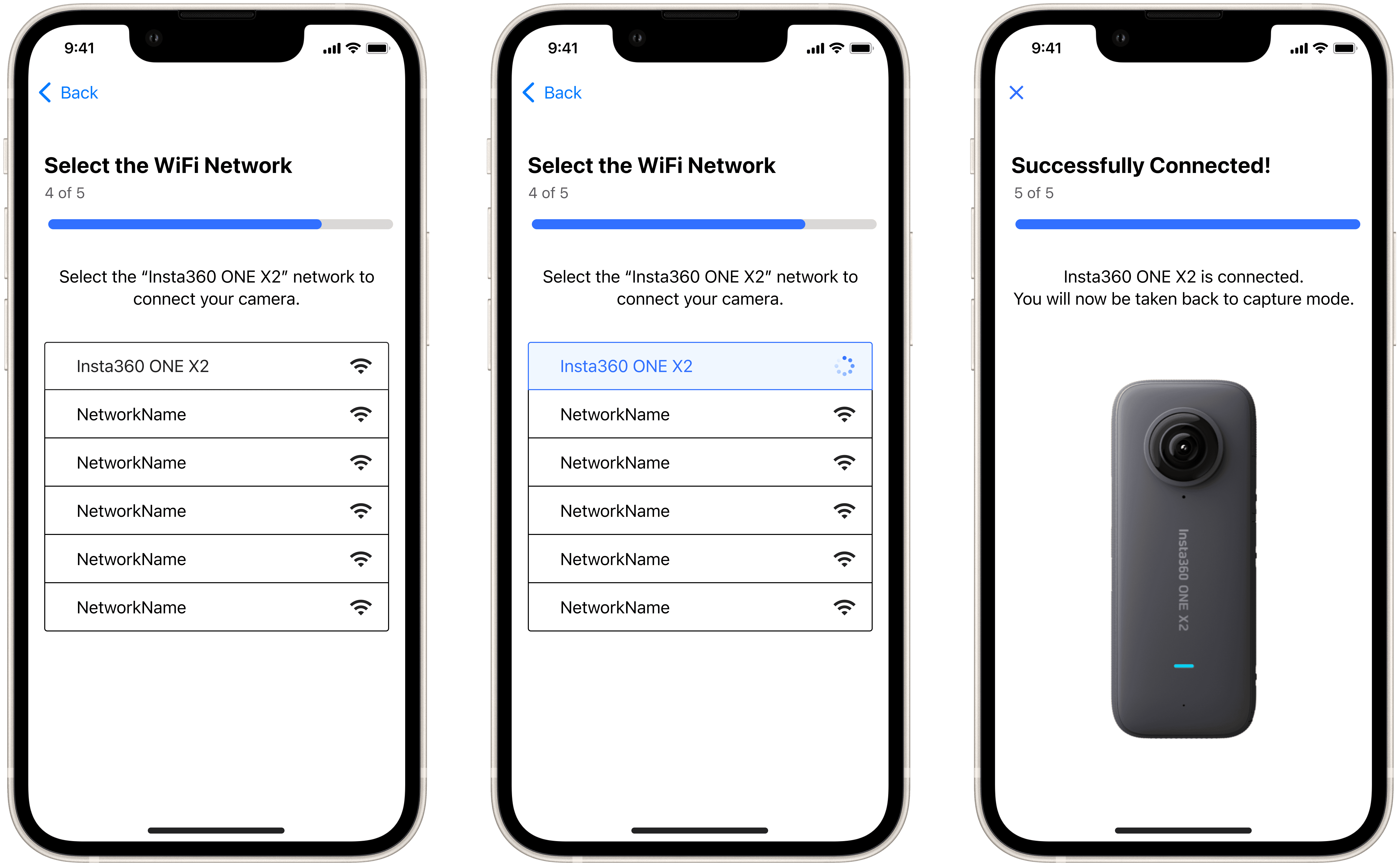
At this point, I reached out to the mobile dev and we were able to finalize that we would be able to auto-fill the password, without having the user enter a password. This was great news! So I designed a WiFi Network list so the user would be able to quickly recognize and select their camera’s network.
However, we also had to consider camera passwords that might have been changed by a user, thus making it unrecognizable and unable to be auto-filled. So I designed a way for users to manually enter their camera password as well as a guide for troubleshooting.
Feedback & Testing
I conducted several tests using prototypes to receive feedback on ease of use, intuitiveness, and overall visual design and layout. After receiving feedback, I iterated on and finalized the designs.
3 out of 4 people mentioned that they liked the design because it does not have many steps/clicks
Users become frustrated when there are too many steps/taps and if the process of “getting the job done” is complicated
2 out of 4 people mentioned that they like that they will not have to leave the app to connect the camera anymore
Keeping everything in-app is more intuitive and brings more delight to the user
2 out of 4 people mentioned that the “Unable to connect your camera?” pop-up doesn’t seem very intuitive or is not very clear
The text might be too small/not stand out as much
Users tend not to read a user guide with a lot of text & we don’t really want them having to go to the help center as their first solution
Possible solutions
Removing the “Unable to connect your camera?” text
Replacing the button text to be clearer (“Manually Connect”/”Start Over”, instead of “Go Back”/Start Over”)
Takeaways
Once the design was finalized, I presented the re-design of the camera connection experience as a prototype during our sprint demo. The re-design was well-received by everyone on the team.
In 2023, this new design was successfully launched and has since brought all of our users a more intuitive and delightful experience.
