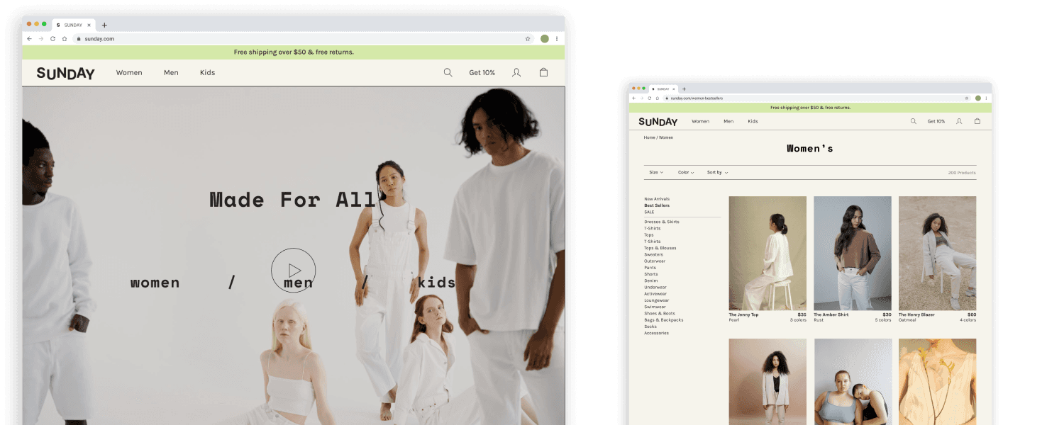
SUNDAY, 2022
Branding
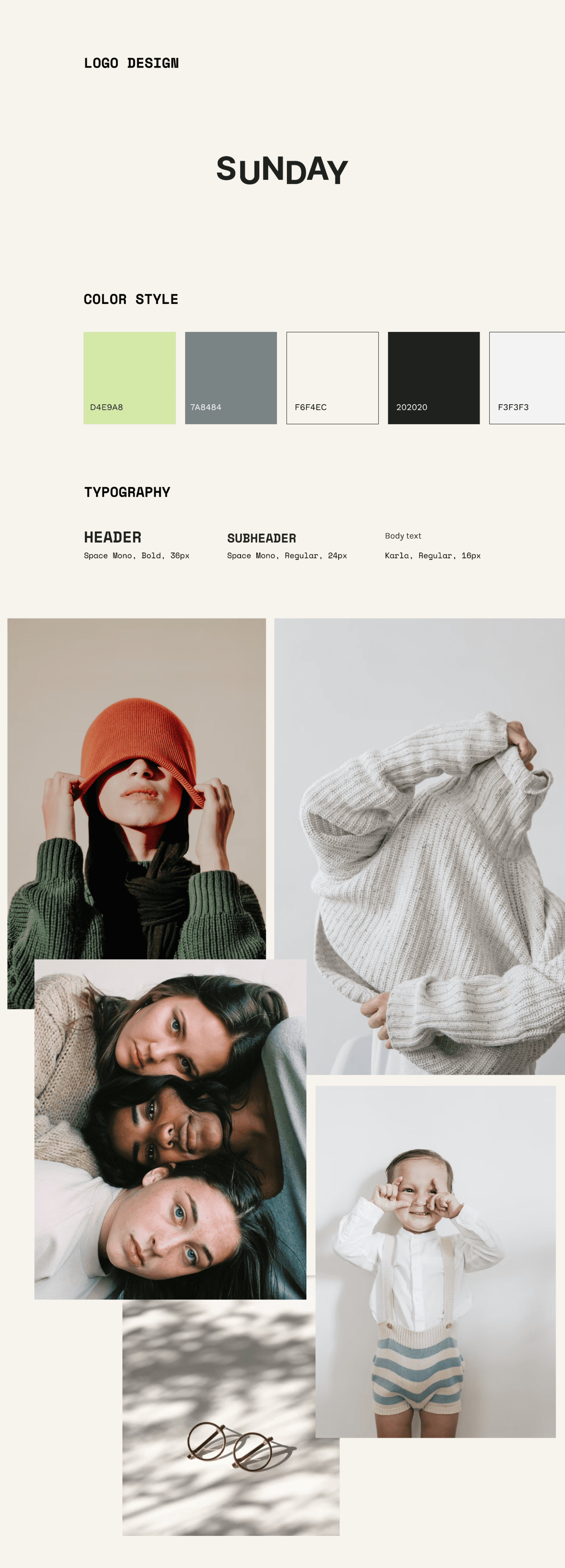
Logo Design
Web Design
Mobile Design
User Research
UI Design
Prototyping & Testing
SUNDAY is a fashion retail shop for the budget-minded individual looking for low-cost clothing for any occasion.
SUNDAY started back in 1994 & is a very large clothing store chain for both adults and children. We deliver quality clothing at lower prices for any occasion. With over 400 stores in 32 countries, we have a successful global presence.
The Problem
SUNDAY has not updated its logo since its inception in 1994. The logo does not look modern and is in need of a rebrand.
SUNDAY is very late in the game of a digital transformation. They previously decided not to invest in digital because preference of keeping the service in person. Customers have been asking about it for years, citing its convenience. It makes their customer’s shopping experience inconvenient and they are missing out on a potentially huge opportunity to reach more customers online.
Business Problem
Because of SUNDAY’s outdated logo and lack of online presence, they are losing out on:
Attracting diverse customers of all ages and styles because of its outdated brand design
A potentially huge opportunity to reach more customers online
Goals
Easily browse through and find products with intuitive filters
Increase website visibility and sales
Empathize
In the empathize phase, I conducted the following research:
Secondary Research — researched the e-commerce industry to understand patterns and trends
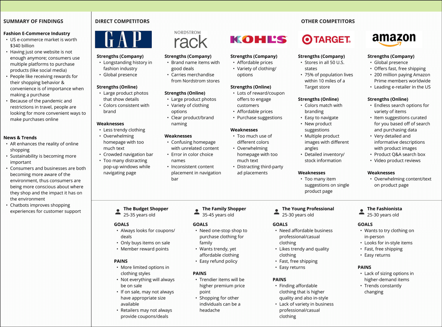
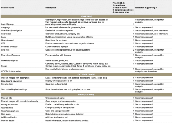
Competitor Analysis — analyzed direct competitors to know their strengths and weaknesses, find patterns, and define any gaps in the market
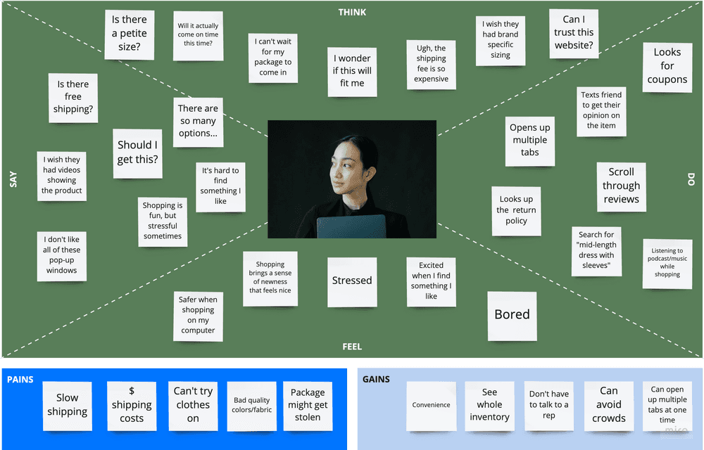
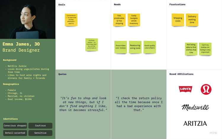
User Interviews — conducted user interviews to understand users and their motivations, desires, needs, and pain points
I researched the fashion e-commerce industry to gain a better understanding of how the fashion e-commerce industry works. Some interesting findings were that:
Having just one website is not enough anymore; consumers use multiple platforms to purchase products (like social media)
People like receiving rewards for their shopping behavior & convenience is of importance when making a purchase
Because of the pandemic and restrictions in travel, people are looking for more convenient ways to make purchases online
In order to get a solid understanding of how our competitors are doing in the market and to lay out a solid foundation, I did a competitor analysis which consisted of direct and indirect competitors.
I found that most of our competitors use large product photos on their website with details, have search features, and offer purchase suggestions. However, some include too many text details and distracting pop-ups that can cause the user to leave the page or become frustrated.
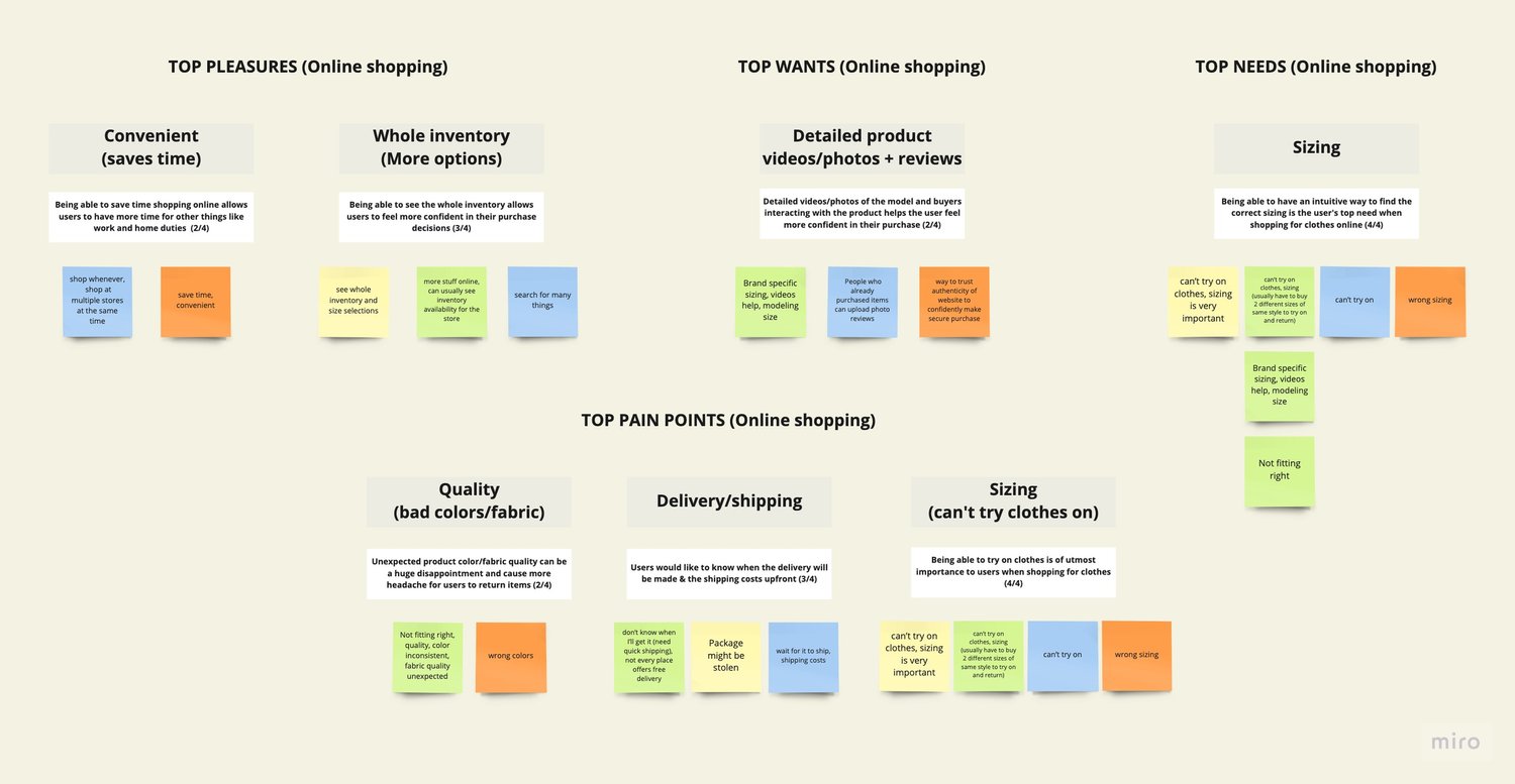
To better understand users and their motivations, desires, needs, and pain points while shopping online for clothes, I recruited and interviewed 4 participants through Zoom and took notes on my laptop while recording each session. Based on the responses, here are the insights that were gathered:
Being able to have an intuitive way to find the correct sizing is the user’s top need when shopping for clothes online
Being able to try on clothes is of utmost importance to users when shopping for clothes
Being able to see the whole inventory allows users to feel more confident in their purchase decisions
Being able to save time shopping online allows users to have more time for other things like work and home duties
Define
Ideate
During ideation, I created the following deliverables:
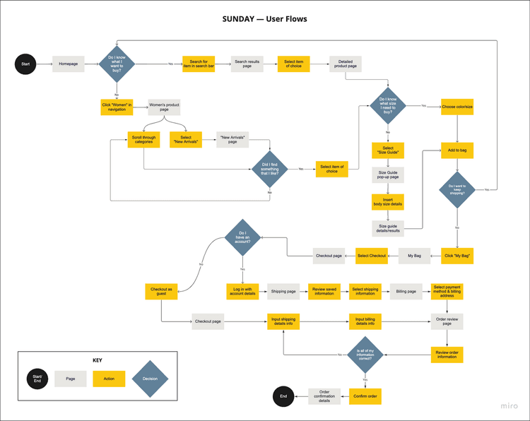
User Flows
Task Flow
Moodboard
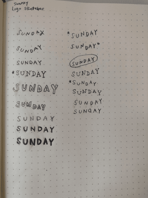
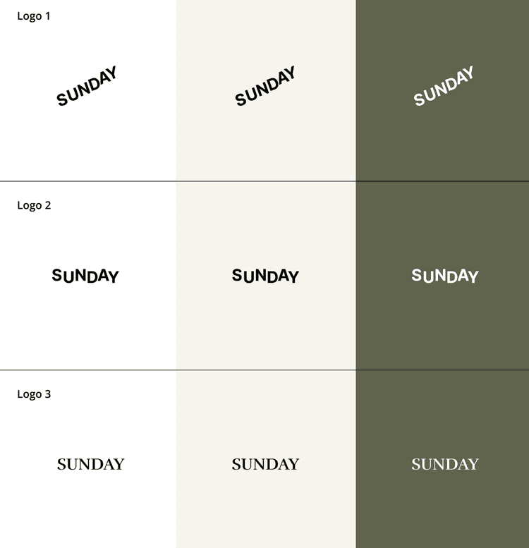
Logo Design Variations
Style Tile
UI Kit
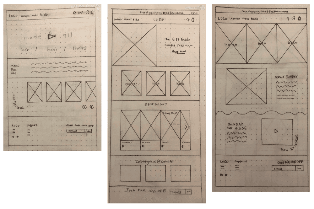
Wireframe Sketches
Lo-Fi Wireframes
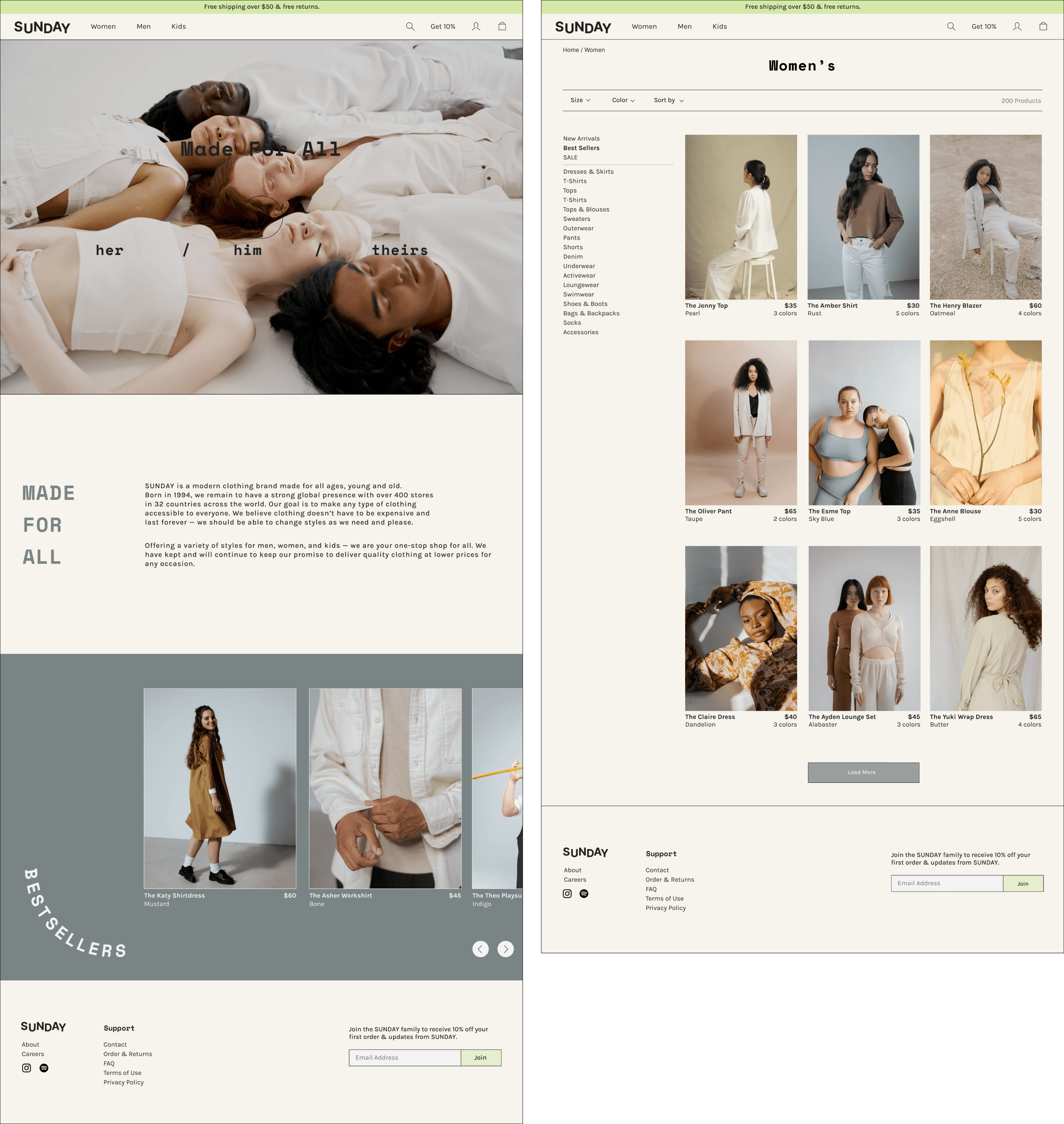
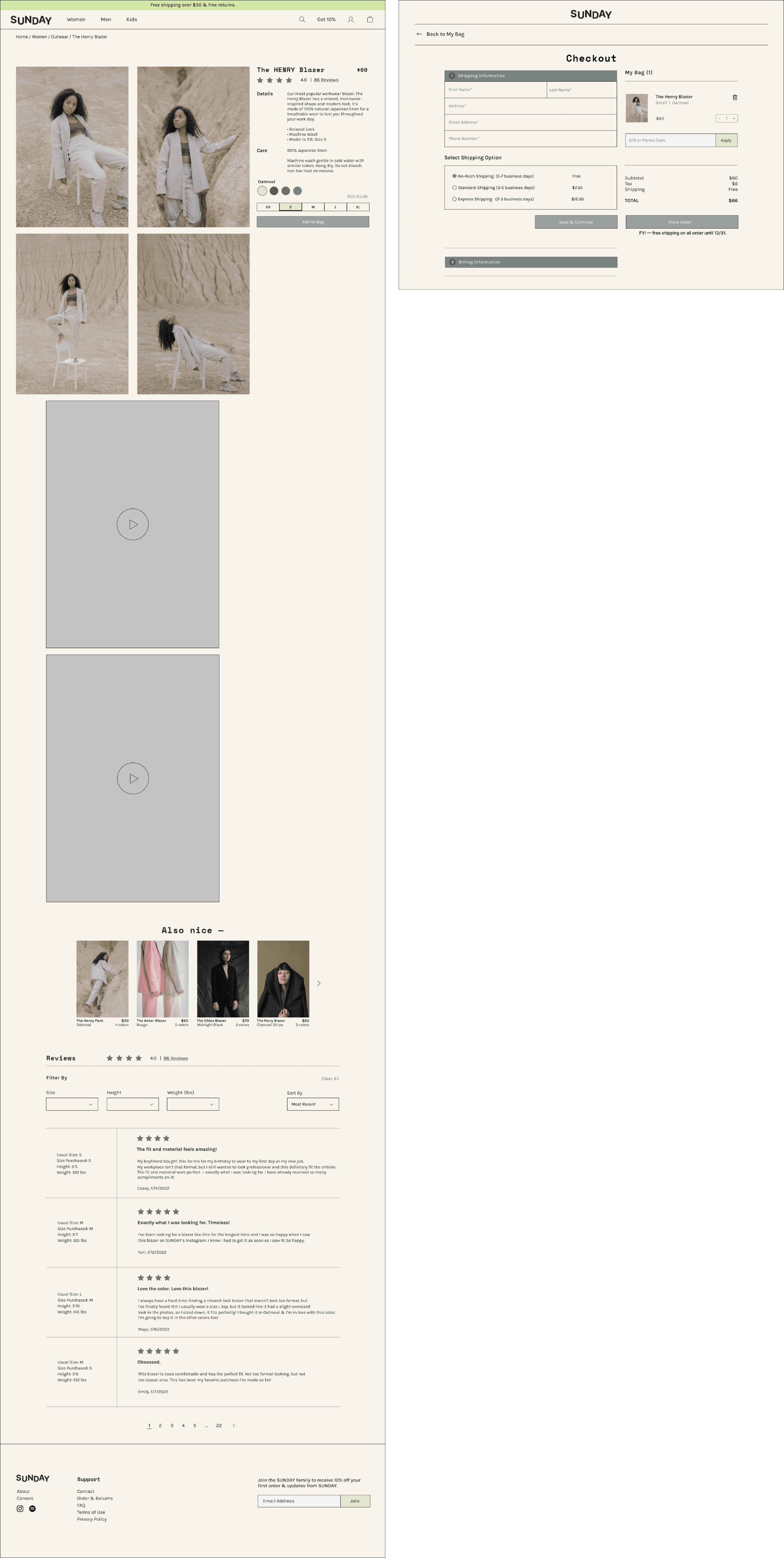
Hi-Fi Wireframes
Test + Iterate
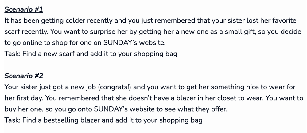
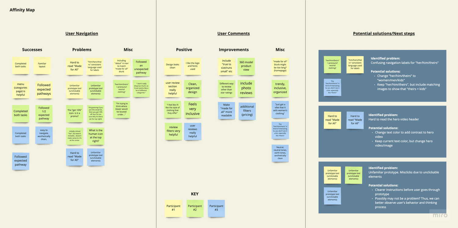
To evaluate how the user interacts with SUNDAY's website & discover any user pain points or difficulties that may arise while navigating the website, I conducted usability testing with 3 participants to test two main scenarios:
Some user quotes:
“The 'her/him/theirs' is kind of interesting because you don't see it a lot, especially the 'theirs'”
“I think the reviews and the sizing [would make me more likely to use this website more]. Knowing what height/weight the people are... especially because you can’t try clothes online”
“Very clean, very organized. I like the colors. I feel like i’ll like the style of clothing that they offer. Feels very inclusive.”
In the future, further testing should be conducted to collect more quantitative and qualitative metrics. Post-launch metrics could also be analyzed to measure business outcomes.
Ways to measure user experience success
User Satisfaction — conducting customer satisfaction (CSAT) tests to see how satisfied users are with the usability of SUNDAY’s website
Task Completion Rate — conducting more usability tests to measure efficiency
Ways to measure positive business outcomes
Increased sales — measure if sales increase after launching SUNDAY’s new website
Sales Conversion rate — measure the number of people who made a purchase out of the total number of people who accessed SUNDAY’s website
Low shopping cart abandonment rate — keep track of shopping cart abandonment rate to ensure there are no obstacles or errors in the checkout process that are keeping people from completing their purchases
Takeaways
Online shopping has become a preferred way of shopping for many in our generation. Especially with the pandemic, people’s shopping habits have vastly changed and businesses have had to adjust and adapt quickly. However, one of the biggest pain points in shopping online (especially for clothing) is worrying if the size will be correct and fit and if the quality of the clothing will look and feel just as it does online. Designing a product that will help users find exactly what they are looking for & need is of utmost importance, without the stress of having to refund or return items that don’t fit or look like it did online.
Focusing on sizing tools, there are more features to explore, like including photos with user reviews, creating a 360° model to help the user control what view they’re trying to see the product from, and creating a different way to rate/review items instead of the traditional 1-5 star rating system (for example, giving a rating for each aspect (i.e., fit, comfort level, etc.), to name a few. These are some other areas of improvement that I would have liked to explore, but was not able to given the time constraint.
In conclusion, it was interesting to see how the user’s past shopping experience helped them to more easily and quickly comprehend and navigate through the website. However, the participant who had the least experience shopping online gave the most unexpected insights and opportunities for growth. This was an exciting study to conduct and makes me wonder and look forward to what new or improved sizing features will be introduced in the industry to help users feel more confident and content in their online clothing purchases.
This was my first time creating a website & also my first full project, so while intimidating, it was really fun and I felt like I learned so much along the way. Navigating through Figma and learning new UX tools (Miro, OptimalSort, Maze — to name a few) had a learning curve, but over time I started to get the hang of it. I think it will come with practice. Also, I felt like there is SO much more to learn, so imposter syndrome was definitely something I had to work through. Progression, not perfection! 👍🏼
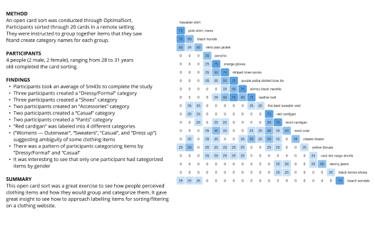
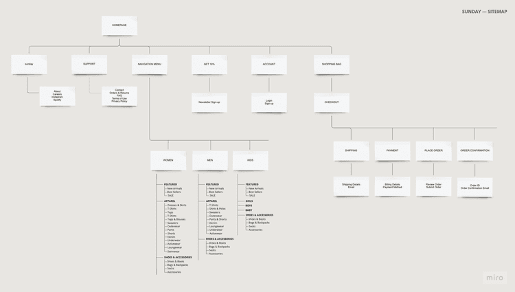
This project helped me learn more about research through conducting user interviews and usability tests. I was also able to dabble in branding, so that portion was really enjoyable. The industry topic is also something I’m interested in, so it made the process all the more enjoyable. Conducting competitive analysis also made me realize that retail e-commerce websites have a lot of similarities, but I think there are opportunities to make a brand really stand out through their website design. Also, I learned about Information Architecture (IA) & realized how important it is for an e-commerce website (especially) with a ton of products!
